Code
pacman::p_load(
  plotly,
  dplyr,
  readr,
  readxl,
  tidyr,
  RColorBrewer,
  ggplot2,
  lubridate
)According to an office report as shown in the infographic below:
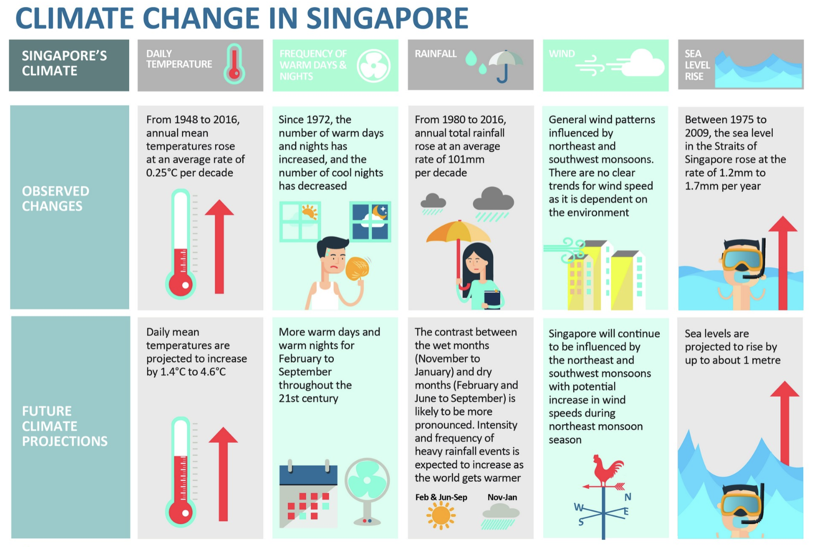
Daily mean temperature are projected to increase by 1.4 to 4.6, and
The contrast between the wet months (November to January) and dry month (February and June to September) is likely to be more pronounced.
As visual analytics greenhorns, we are keen to apply our newly acquired skills in visual interactivity and visualizing uncertainty methods to validate the claims presented above.
In this take-home exercise, we are required to:
Choose a weather station and download historical daily temperature or rainfall data from the Meteorological Service Singapore website.
Select either daily temperature or rainfall records for a month from each of the years 1983, 1993, 2003, 2013, and 2023, and then create an analytics-driven data visualization.
Apply appropriate interactive techniques to enhance the user experience in data discovery and/or visual storytelling.
For my analysis, I’ve selected Tengah weather station and I have chosen to concentrate on daily temperature data for the month of June from each of the years 1983, 1993, 2003, 2013, and 2023 to validate the claim that projects an increase in daily mean temperatures by 1.4 to 4.6 degrees Celsius.
pacman::p_load() function from the pacman package is used in the following code chunk to install and call the libraries of multiple R packages:
pacman::p_load(
plotly,
dplyr,
readr,
readxl,
tidyr,
RColorBrewer,
ggplot2,
lubridate
)Historical daily temperature from Meteorological Service Singapore is provided for the task.
The following code segment utilizes the read_excel() function from the readxl package to load data from an Excel file into the R environment. This operation imports the dataset titled “Tengah_Jun_1983_2023.xlsx” into a dataframe.
# Specify the path to the Excel file
file_path <- ("../../data/Tengah_Jun_1983_2023.xlsx")

# Import the data into a dataframe
df <- read_excel(file_path)Numeric Conversion: Converted Mean Temperature (°C) to numeric, handling non-numeric values as NA to ensure data consistency.
Missing Values: Filtered out NA values to clean the dataset for analysis.
Annual Mean Calculation: Grouped data by year to calculate June’s mean temperature, simplifying trend analysis.
Date Column Creation: Formed a Date column for accurate temporal visualization.
Simplicity and Clarity: Clear plot titles, axis labels, and a legend make the visualization straightforward to interpret.
Color Utilization: Colors distinguish between years, facilitating quick visual comparison.
Interactive Features: Tooltips provide detailed information, allowing for an interactive, exploratory data experience.
Trend Representation: A connecting line through annual means visualizes temperature trends over time effectively.
# Convert non-numeric values to NA in 'Mean Temperature (°C)' column
df$`Mean Temperature (°C)` <- as.numeric(as.character(df$`Mean Temperature (°C)`))

# Handle possible warning from conversion by coercing issues to NA
df$`Mean Temperature (°C)`[is.na(df$`Mean Temperature (°C)`)] <- NA

# Calculate the mean temperature for each year
mean_temperatures <- df %>%
  group_by(Year) %>%
  summarize(MeanTemperatureJune = mean(`Mean Temperature (°C)`, na.rm = TRUE))

# Create a Date column for each entry in df
df <- df %>%
  mutate(Date = as.Date(paste(Year, Month, Day, sep="-"))) %>%
  filter(!is.na(Date))  # Ensure there are no NA Dates

# Assuming 'mean_temperatures' holds the mean temperature for each June as calculated before
mean_temperatures <- mean_temperatures %>%
  mutate(Date = as.Date(paste(Year, 6, 15, sep="-")))  # Use the middle of June as the representative date

# Plot the daily mean temperatures using `df`
p <- plot_ly() %>%
  add_markers(data = df, x = ~Date, y = ~`Mean Temperature (°C)`, color = ~as.factor(Year),
              text = ~paste("Date:", format(Date, "%Y-%m-%d"), "Mean Temp:", `Mean Temperature (°C)`),
              hoverinfo = 'text', marker = list(size = 5)) %>%
  layout(title = 'Daily Mean Temperature in June (1993 - 2023)',
         xaxis = list(title = 'Date'),
         yaxis = list(title = 'Mean Temperature (°C)'))

# Add the mean temperature points as markers
p <- p %>% add_markers(data = mean_temperatures, x = ~Date, y = ~MeanTemperatureJune,
                       marker = list(color = 'black', size = 10),
                       name = 'Mean Temperature')

# Connect the mean temperature points with a line
p <- p %>% add_lines(data = mean_temperatures, x = ~Date, y = ~MeanTemperatureJune,
                     line = list(color = 'black', width = 2),
                     name = 'Mean Temperature Trend')

# Display the plot
p
Interpretation
From 1993 to 2003, there was a noticeable drop in the mean temperature for June. The initial values were relatively high but declined over this decade.
In the following decade, from 2003 to 2013, the trend reversed, with an increase in the mean temperature for June.
From 2013 to 2023, the trend shows another downturn, with mean temperatures for June decreasing once again.
This non-linear pattern suggests variability in mean temperatures for the month of June across the selected years. The trend line, which connects the mean temperatures for the specified years, indicates alternating periods of warmer and cooler Junes rather than a steady directional trend.
Numeric Conversion: Converted Mean Temperature (°C) to numeric.
Day of Month Extraction: A new variable is created to represent the day of the month, derived from existing 'Day' columns.
Year Factorization: The 'Year' column is transformed into a categorical variable to distinguish each year in the visualization.
Heatmap Calendar: The heatmap is selected for visualizing temperature data due to its efficacy in representing complex data with intuitive color gradations. This type of visualization excels in pattern recognition, allowing viewers to discern trends such as rising or falling temperatures over years with a simple color shift. It also condenses a large amount of data, displaying daily temperatures over several years in a compact format. The intuitive color mapping, with blue indicating cooler temperatures and red indicating warmer, makes the data accessible without the need for detailed analysis. Additionally, heatmaps enable easy comparison of data points, such as the temperature on a specific day across multiple years, or the change in temperature throughout the month of June, providing a clear visual tool for comparing and analyzing temporal temperature data.
Use of ‘geom_tile’: This geom creates a tile for each day of each year, with the color representing the mean temperature.
Gradient Color Scale: A gradient color scale represents temperatures, with ‘low’ mapped to ‘blue’ (cooler temperatures) and ‘high’ to ‘red’ (warmer temperatures). This intuitive use of color temperature aids in quickly assessing data.
Interactivity with plotly: By converting the ggplot object to a plotly object, interactivity is introduced. Users can hover over tiles to see details about the date, year, and mean temperature.
Text Tooltip: The tooltip is custom-formatted to display the date, year, and temperature when hovering, enhancing user engagement and understanding.
Minimalist Theme: The 'theme_minimal' is applied, which keeps the focus on the data by reducing non-data ink.
Color as Data: The use of color is not only for aesthetic but also serves a data-driven purpose, encoding the mean temperature in an understandable manner.
Title and Labels: Clear titles and axis labels are provided, which is a best practice for data visualization to ensure viewers understand the context of the data presented.
# Ensure that 'Mean Temperature (°C)' is a numeric variable
df$`Mean Temperature (°C)` <- as.numeric(as.character(df$`Mean Temperature (°C)`))

# Create 'DayOfMonth' based on 'Date' or 'Day' column
# Ensure that 'Date' or 'Day' column exists and is in the correct format
if("Date" %in% names(df)) {
  # If 'Date' column is present and in the Date format
  df$DayOfMonth <- day(df$Date)
} else if("Day" %in% names(df)) {
  # If 'Day' column is present and represents day of the month
  df$DayOfMonth <- df$Day
} else {
  stop("The dataset does not have a 'Date' or 'Day' column in the expected format.")
}

# Assuming the 'Year' column is numeric and contains only the years of interest
# We convert it to a factor to ensure it is treated as a discrete variable
df$Year <- factor(df$Year)

# Create the ggplot heatmap plot
p <- ggplot(df, aes(x = DayOfMonth, y = Year, fill = `Mean Temperature (°C)`)) +
  geom_tile(aes(text = paste("Date: ", DayOfMonth, " June ", "Year: ", Year, "<br>Temp: ", `Mean Temperature (°C)`)), color = "white") +
  scale_fill_gradient(low = "blue", high = "red") +
  labs(title = "Heatmap Calendar for the Month of June",
       x = "Day of the Month",
       y = "Year",
       fill = "Mean Temperature (°C)") +
  theme_minimal()

# Convert to an interactive plotly object
ggplotly(p, tooltip = "text")
Interpretation
Days in June 2023 appear to have varied temperatures, with some days being cooler (blue tiles) and some being much warmer (red tiles). In contrast, June 2013 has consistently higher temperatures, as indicated by the prevalence of red tiles.
There appears to be no consistent pattern of warming or cooling when comparing the same days across the years displayed. Some days in June 2023 are among the coolest recorded, while others are the warmest, suggesting significant variability.
Numeric Conversion: Converted Mean Temperature (°C) to numeric, handling non-numeric values as NA to ensure data consistency.
Missing Values: Filtered out NA values to clean the dataset for analysis.
Annual Mean Calculation: Grouped data by year to calculate June’s mean temperature, simplifying trend analysis.
Ordering Data: The dataframe annual_avg_temps is ordered by ‘Year’ to ensure the line graph’s continuity.
Year-to-Year Difference: The code calculates the year-to-year temperature change using the diff function and replaces the resulting NA from the first difference operation with 0.
Cumulative Change: Cumulative temperature change is computed with the cumsum function to show the progressive change over the years.
Numeric Year: The 'Year' column is cast to numeric to be used as a continuous axis in the plot.
Line Graph: A line graph is particularly useful for depicting cumulative temperature changes over time, as it excels in visualizing trends and changes in a clear and concise manner. It facilitates time series analysis by illustrating the sequence and duration of trends, highlighting seasonal effects or any anomalies. The format of a line graph aids in understanding the magnitude and direction of changes between consecutive data points.
Connecting Points: The geom_line() function in ggplot2 is used to draw a line connecting the points, emphasizing the progression and trends in the data.
Interactivity: Conversion of the ggplot object to an interactive plotly object allows for dynamic exploration of the data. Hovering over data points displays a tooltip with detailed information.
Tooltip Information: Customized tooltips show the year, cumulative temperature change, and annual change, making it easy to track changes over time.
Minimalist Design: theme_minimal() is applied to reduce visual clutter, focusing the viewer’s attention on the data.
Labels and Title: Descriptive labels and a title are provided, explaining the graph’s context and the nature of the data shown.
Grouping: Explicit grouping in the aes() function ensures the line graph represents a single series of connected data points.
# Make sure the 'Mean Temperature (°C)' column is numeric
df$`Mean Temperature (°C)` <- as.numeric(as.character(df$`Mean Temperature (°C)`))

# Calculate the annual average temperatures
annual_avg_temps <- df %>%
  group_by(Year) %>%
  summarize(AverageTemp = mean(`Mean Temperature (°C)`, na.rm = TRUE)) %>%
  ungroup()  # Make sure to ungroup for subsequent operations

# Check if the dataframe is ordered by Year
annual_avg_temps <- arrange(annual_avg_temps, Year)

# Calculate the year-to-year differences
annual_avg_temps <- mutate(annual_avg_temps, TempChange = c(NA, diff(AverageTemp)))

# Remove the NA introduced by the diff function
annual_avg_temps$TempChange[is.na(annual_avg_temps$TempChange)] <- 0

# Calculate the cumulative temperature change
annual_avg_temps$CumulativeChange <- cumsum(annual_avg_temps$TempChange)

# Ensure that Year is treated as a numeric variable for plotting
annual_avg_temps$Year <- as.numeric(as.character(annual_avg_temps$Year))

# Create a ggplot object with the correct dataframe
# Ensure that we explicitly group the data to draw the line correctly
p <- ggplot(annual_avg_temps, aes(x = Year, y = CumulativeChange, group = 1)) +
  geom_line() +  # Ensure that this line is connecting the points
  geom_point(aes(text = paste("Year: ", Year,
                              "<br>Cumulative Change: ", CumulativeChange,
                              "<br>Annual Change: ", TempChange))) +
  labs(title = "Cumulative Temperature Change Over Time",
       x = "Year",
       y = "Cumulative Temperature Change (°C)") +
  theme_minimal()

# Convert ggplot object to an interactive plotly object
p <- ggplotly(p, tooltip = "text")

# Print the interactive plot
p
Interpretation
This line graph presents the cumulative change in temperature from a baseline year(1993) to 2023. The y-axis quantifies the cumulative temperature variation in degrees Celsius, while the x-axis tracks the progression of years. Starting from zero change, the graph reveals a rise in cumulative temperature, climaxing in 2013 with an approximate increase of 0.86 degrees Celsius from the baseline, and an annual change in that year of around 1.05 degrees Celsius, indicating a substantial escalation relative to the baseline.
Post-2013, the graph shows a sharp downturn, with a notable reduction in cumulative temperature by 2023, although the overall change remains positive, signifying a rise from the start of the recorded period. The detailed tooltip for 2023 discloses a cumulative increase of roughly 0.24 degrees Celsius since the baseline, juxtaposed with a significant annual decrease of about -0.62 degrees Celsius from 2013 to 2023.
The observed pattern of increase followed by a decrease may reflect periodic fluctuations rather than a steady trend of warming, suggesting the influence of various climatic elements or the inherent variability of the dataset.
'Year' column in the dataframe (df) is converted to a factor. This is important because box plots categorize data based on discrete groups, and in this case, each year represents a different category.Plotly for Interactivity: The use of plot_ly from the Plotly package makes the box plot interactive. This allows users to hover over the plot to get precise information about the mean temperatures for each year (hoverinfo = ‘y+x’).
Color Coding: Assigning colors to different years (color = ~Year) enhances the visual distinction between boxes, making it easier to compare between years.
Hover Information: The hoverinfo attribute is set to display both the year and the mean temperature when a user hovers over a box, providing a quick summary without clicking or searching.
Layout Configuration: The layout function is used to set the titles for the plot and axes, contributing to the plot’s readability and professionalism.
df$Year <- as.factor(df$Year)

# Create the Plotly Box Plot
p <- plot_ly(df, y = ~`Mean Temperature (°C)`, x = ~Year, type = 'box',
             color = ~Year,
             hoverinfo = 'y+x') %>%
  layout(title = "Box Plot of Daily Mean Temperatures for June Over Decades",
         xaxis = list(title = "Year"),
         yaxis = list(title = "Mean Temperature (°C)"))

# Display the plot
p
Interpretation
1993: The median temperature for June 1993 is approximately 27.75°C, with the lowest temperature around 25.5°C and the highest around 29.8°C. The interquartile range (IQR), which spans from the first quartile (q1) at about 27.3°C to the third quartile (q3) at about 28.9°C, indicates where the middle 50% of the data points lie.
2003: The median temperature for June 2003 is higher than that of 1993, at around 28.15°C. The temperature spread is from a minimum of 25.1°C to a maximum of 29°C, with the IQR between 27.2°C (q1) and 28.7°C (q3).
2013: In 2013, the median temperature for June further increased to approximately 29.1°C, which is the highest median among the presented years. The range of temperatures is quite broad, stretching from a minimum of 26.6°C to a maximum of 29.8°C. The IQR is between 28.325°C (q1) and 29.4°C (q3). Notably, there is an outlier at around 26°C, which is significantly lower than the rest of the data for that year.
2023: The median temperature for June 2023 is around 28.2°C, lower than that of 2013 but still higher than 1993 and 2003. The minimum temperature is around 26.4°C, and the maximum is close to 29.8°C, with the IQR extending from 27.4°C (q1) to 28.7°C (q3).
The median temperatures indicate a general upward trend from 1993 to 2013, with a slight dip in 2023. The outlier in 2013 is an interesting point that warrants investigation as it could represent an unusual weather event. Overall, the box plots suggest variability in daily mean temperatures for June over the years, with a slight overall increase in median temperatures over the three decades.
Numeric Conversion: Converted Mean Temperature (°C) to numeric.
Interpolating Missing Values: Missing temperature values are interpolated within each year, ensuring a continuous dataset for analysis. The zoo::na.approx function is used for interpolation, which is useful for time series data.
Year Conversion: The 'Year' column is converted to numeric to facilitate its use in regression analysis.
Averaging Temperatures: The dataset is grouped by 'Year' to calculate the average mean temperature for each year, omitting NA values with na.rm = TRUE.
Interactivity with Plotly: The ggplot object is converted to a plotly object, which allows for interactive exploration of the data. Users can hover over data points to see detailed information.
Hover Text: The text aesthetic is used to create custom hover text for each point, displaying the year and average temperature.
Minimalist Aesthetic: theme_minimal() is applied to the ggplot object to provide a clean and distraction-free visualization.
Accessibility of Model Coefficient: The code checks for the presence of a 'Year' coefficient in the model, and if present, it is printed out. This coefficient represents the average change in temperature for each year and is critical for understanding the trend.
# Make sure the 'Mean Temperature (°C)' column is numeric
df$`Mean Temperature (°C)` <- as.numeric(as.character(df$`Mean Temperature (°C)`))

# Interpolate missing values
df <- df %>%
  group_by(Year) %>%
  mutate(`Mean Temperature (°C)` = zoo::na.approx(`Mean Temperature (°C)`, na.rm = FALSE)) %>%
  ungroup()

# Ensure Year is numeric for the regression
df$Year <- as.numeric(as.character(df$Year))

# Calculate the average mean temperature for each year
average_temperatures <- df %>%
  group_by(Year) %>%
  summarise(AverageMeanTemperature = mean(`Mean Temperature (°C)`, na.rm = TRUE))

# Fit a linear regression model
model <- lm(AverageMeanTemperature ~ Year, data = average_temperatures)

# Create a ggplot with text aesthetic for hover info on points
p <- ggplot(average_temperatures, aes(x = Year, y = AverageMeanTemperature)) +
  geom_point(aes(text = paste("Year:", Year, "<br>Temperature:", AverageMeanTemperature))) +
  geom_smooth(method = "lm", color = "blue") +
  labs(title = "June Average Mean Temperature Trend (1983, 1993, 2003, 2013, 2023)",
       y = "Average Mean Temperature (°C)", x = "Year") +
  theme_minimal()

# Convert ggplot object to plotly for interactivity, ensuring hover info is on points
ggplotly(p, tooltip = "text")# If the 'Year' coefficient exists, it will be printed here
if("Year" %in% names(coef(model))) {
year_coef <- coef(model)["Year"]
print(year_coef)
} else {
print("The 'Year' coefficient does not exist in the model.")
} Year
0.01975287 Interpretation
Trend Line: The slope of the trend line suggests a slight increase in the average mean temperature over the 40-year span. Since the regression line is upward sloping, we can infer a general warming trend over these years for the month of June.
Data Points: Individual data points are marked for each of the years in question. They represent the actual observed average mean temperatures for the month of June in those years.
Confidence Interval: The shaded area around the trend line represents the confidence interval (often set at 95% confidence). This wide interval suggests a significant degree of uncertainty or variability in the temperature trend, indicating that while there is a general trend, individual years may vary quite a bit from the trend.
Coefficient Value: The year coefficient printed below the graph (approximately 0.01975) quantifies the rate of change per year. It implies that the average mean temperature for June has increased by about 0.01975°C per year over the period studied.
In conclusion, the upward shift in median temperatures seen from the box-plot analysis, suggest a warming trend. There’s also an increase in the interquartile range, indicating greater temperature variability. The linear regression analysis gives a coefficient of approximately 0.0198°C per year. Over a 40-year period from 1983 to 2023, this would account for a warming of roughly 0.594°C (0.0198°C/year * 30 years), which is an increase but not within the projected increase. The claim of an increase in daily mean temperatures by 1.4 to 4.6 degrees Celsius is not fully supported by the data and analyses provided from the Tengah weather station. It is important to note that this analysis is based solely on the data for the month of June across selected years and does not take into account other months or the entirety of the annual temperature trends. The claim might be valid when considering a broader range of data or different time spans within each year. Moreover, the claim may also be considering projections into the future beyond the current data (up to 2023), and these projections might be based on climate models that account for various factors like rainfall patterns, wind speed and direction, sea-level changes.